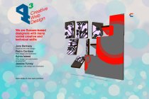
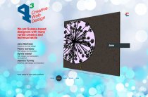
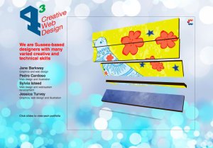
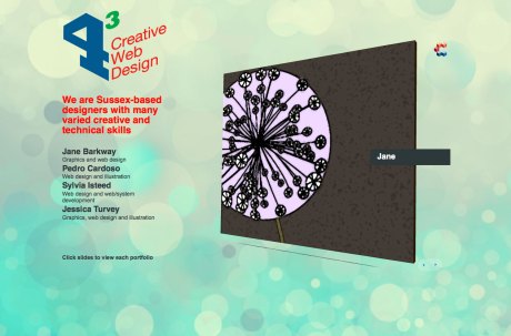
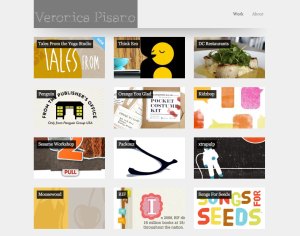
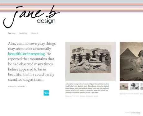
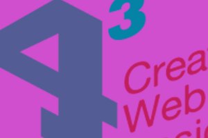
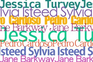
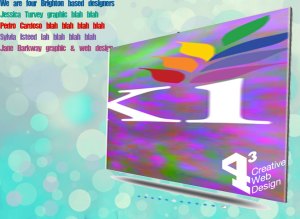
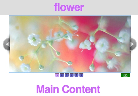
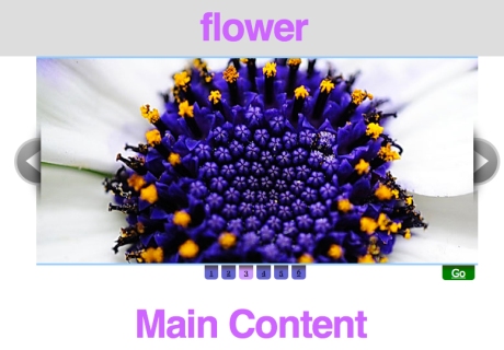
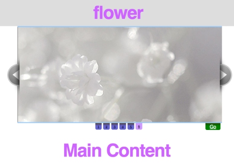
These shots are from the showcase website that I designed with Jess, Sylvia and Pedro. We used the cuber slider to show an example of work and to act as a link to our personal portfolios. The background is also changing behind the cuber.


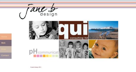
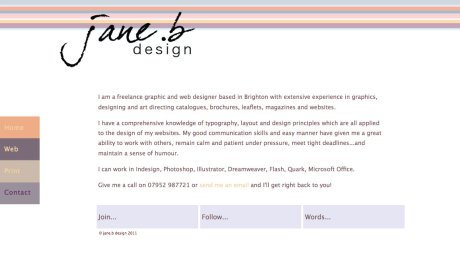
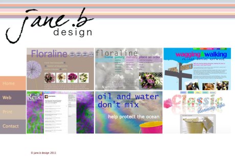
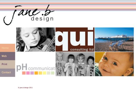
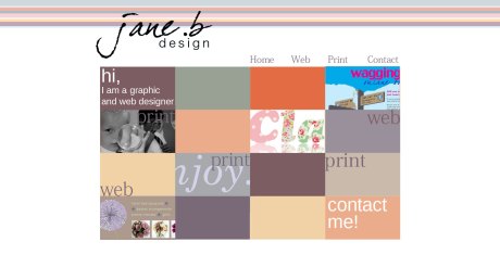
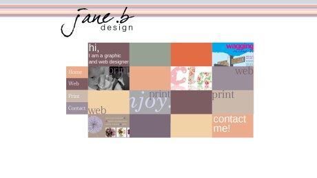
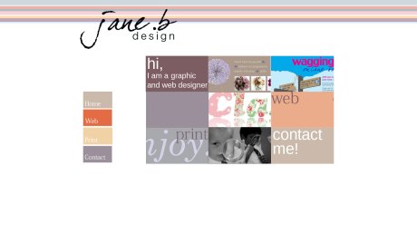
This is the homepage, web, print and contact pages of my portfolio site. The navigation sidebar remains static on all the pages so that when more work is added onto the print and web pages it will be easy to navigate, wherever the visitor has scrolled down to.

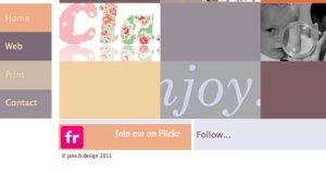
The social network icons slide up in a different box when the mouse hovers over the boxes under the main content.

This is the favicon for the site.

Business card

After making most of the major design decisions for my site I decided to start building it in Dreamweaver. I place the coloured stripes, logo and coloured boxes containing the cropped images into their divs, lining everything as I wanted. I looked up to see if I could find a way of fixing the side bar so that it would remain static while the page was scrolled. I found one on CSS tricks and after a lot of fiddling managed to get it to work!!

While I was looking on their site I saw quite a few interesting things to add so decided to attempt some drop down boxes to put the social network icons in. They would only be visible when the mouse is positioned over the top layer box. This was even more difficult to style the way I wanted but with perseverance I did it!

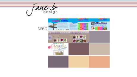
The next page to build was the web page. I sized up the thumbnails of the sites I wanted to show, and then linked to the first main shot in the slimbox pop out window. I changed the colour of the slimbox background, settling on a dark grey to match the bottom bar of the box that I had changed from white. I changed the size and style of the text in the box to fit with my site. I did have difficulty getting the pictures in each gallery to show in the correct order at first. They kept appearing back to front. When I changed the order in the code, the numbers on the slide appeared back to front. In the end I worked out that the the thumbnail code follows the first picture in the gallery, and then the rest of the pictures in the gallery follow the thumbnail.

I linked all the pages together and put in hotspots on the images on the home page to their relevant page. I linked the social network icons to their sites and the email link to my address.

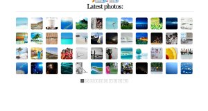
I have been looking at some of the gallery options that I think would suit the type of site I would like to make. I think lots of them are a bit too gimmicky for a designer. After looking at a great number of portfolio sites, I think this can end up being quite off-putting, and not really very stylish. The ones I like are quite simple. Most are on the Picsviewr site, some it is easy to change the background colour, some I am not so sure, I think I would like a white background at the moment.

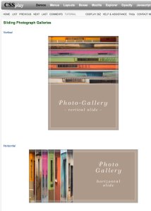
                         I really like this last slider, it squashes the images and shows them as tabs for you to click on to open the picture you want. I would like to use this but not sure if it is appropriate for a gallery.

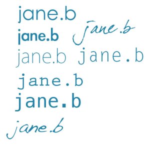
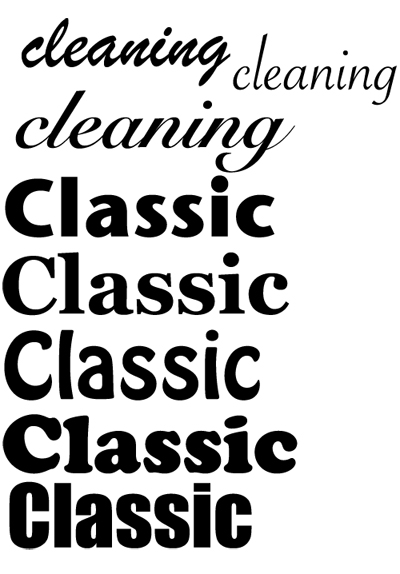
I have a vague idea what I would like my logo to look like, so started trying out some faces.

I want to make the logo seem personal and friendly, so I tried a few logo designs using the handwriting fonts that I like.


I had a look at quite a few other free gallery sites. Portfolio and Carbonmade had some that I liked. The ones I liked the best though were on Cargo. I’m not sure at the moment how tricky it is to use.


I did a couple of layouts using the logos I liked and some of the gallery ideas.


I have signed up for a Carbonmade site, also Cargo, which I really like. I am going to add my work to both of these but first I am going to have another go with Dreamweaver, it maybe the last…Rapidweaver beckons!

Firstly I made a final,(I hope) decision on the logo.  

I loaded a Pictobrowser into the first page I tried. I was quite pleased with the result but wanted to try my own layout in Dreamweaver using slimbox pop out boxes.


I layed out the Home page in Photoshop. I’m not sure about the navigation at the moment. I would like to look at locked tabs on the side. I’ll see what I can find. I am planning to have four pages at the moment, with links in the Home page boxes to the Web and Print page galleries.

On the two gallery pages will be cropped pictures of the work which when clicked will open as slimbox pictures. I was going to put small pictures butted up together as the gallery page but changed my mind and decided to put one cropped picture to open. Looking at this now I think I am going to change my mind again. I think it will be easier for a viewer to get a quick idea of the work if more pictures are easily visible.I thought it looked messy showing different pages of the same site next to each other, and boring for someone trying to get a quick overview of the work. In the end I decided to have 3 columns of thumbnails with a small white border between them. This means that I can add as many rows as I like, just scrolling down the page to view but putting side navigation which I will try and find out how to fix position so that the visitor will be able to navigate between pages however far down the page they scroll.I tried the navigation at the side and experimented with the number of columns and layout of the page.  

I will put the social network links under the main boxes.

After meeting with the client (Phil briefing us on our final project) we were formed into teams to research, discuss and record the requirements of the brief.

Our team consists of myself, Jessica Lewis, Sylvia Isteed and Pedro Cardoso.

Initially we concentrated on who would take care of the various tasks and then started to think about the name of the group. Jess will put the proposal together and take minutes. Sylvia will put the action plan, timeline together, I am putting the budget together and all looking at logos.

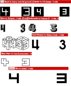
In our first meeting we decided to call ourselves ‘4 cubed’, which we thought was memorable and had potential for a strong logo. We looked at the style of site we wanted and whether or not we wanted our portfolio sites to be separate.

I looked at the budget which I put together after looking at some examples from last year, this will be discussed in our next class meeting.

I started looking at a few logo ideas which we will look at during the next class meeting along with ideas from the other group members.


We decided to use the Cuber image slider for the main showcase page. This gives a very unique 3D look and feel, driven by Flash. We thought this would look really strong with our boldest pieces of work in the slider against muted, probably illustrative backgrounds.

In our next class meeting Sylvia had produced a prototype showing how she had got the backgrounds to fade in over each other using the ‘z’ index as there was not an option to use opacity. She found that the Javascript which we need to talk to our Flash action script clashes, so we will not be able to correspond the individual pages on the Cuber with the background for each person, with one click. We agreed that we would have to be happy with the buttons on the Cuber linking to our work and the backgrounds being on a continual loop.

We looked at the logos which we had designed. We agreed on a logo that Jess had done with a few minor tweaks on the angles and type. We agreed to include a strap line as part of the logo which would be ‘Creative Web Design’. This could be read as a short sentence or as three separate skills. We agreed not to use Brighton or Sussex in the logo but thought it would be a good idea to use in the short paragraph to be included on the main Showcase page.

Pedro showed us some backgrounds he had done in Photoshop using brushes. They were really effective and produced a very sunny feel. We agreed that if we had different colours and slightly different layouts they would give a very shimmery, summery ‘Brighton’ feel to the site.
Pedro agreed to try some different colours and layouts to fade into each other and Sylvia will put them in the prototype for next week.

May 11

This week Pedro worked on more backgrounds, we decided on some colours and  Sylvia put them into the prototype to see how they looked. We now need to make a decision on the layout of the showcase page and the first slide of the Cuber.

I looked at a few ideas for the first page of our cuber, just to get the ball rolling and have a starting point next week when we meet up.


I also did a quick layout to show how the elements could be positioned on the first page.

For our first task in our final project we have to research and analyse a range of portfolio websites. They are to be for anyone in the creative field including web designers, graphic designers, illustrators and photographers.

There are some really amazing portfolio sites, but after looking for a while I found some of them a bit over the top and quite irritating, either because of load times or they were just too complicated. It was quite hard to find really clean, simple minimal designs that remained interesting.

Charlie Gentle a web designer, is one of those. He has a very simple, stylish site. He implements perfect jQuery style, I really like the way the information glides to the left as you click on the navigation. He uses nice sketch elements and illuminated centered content. The background is a lovely subtle textured blue, with really clear contemporary typography.  The information about Charlie is friendly, clear and includes a blog.

Thibaud’s portfolio uses color swatches as interactive elements, which not only hints at the nature of his work but also effectively showcases his skill, experience and creativity in interactive design. This site is really slick.

   This site uses a really lovely background, and slides horizontally. The site is very simple, but all the information is there about each project if you want it. The home page is probably more interesting than anything else though. It is not easy to get back to the home page and the contact button is not very prominent.

This site is intriguing in the same way a dolls house is, looking into each room. It looks like it may be over complicated but is very well organised and easy to use.

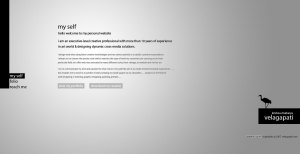
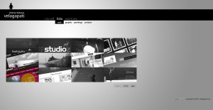
  I really like the simplicity of this site. There is a very clear contact button, with only three buttons for the side navigation. The portfolio page is really simple using black and white shots of each project that turn to colour on rollover. If you click on the piece of work you are interested in there is a large slimbox version that opens.

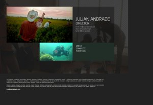
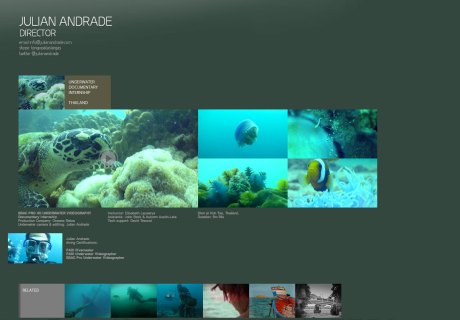
Julian Andrade is a film director. His site is really simple and easy to navigate. There is only one place to enter the site. This takes you to a gallery page where stills from the work are arranged in a colourful block. On rollover a coloured block tells you who the job was done for and what the involvement was. When you click on a particular job a page opens which shows still images from the film and a video where you can view the action. Each page is layed out in the same way to keep fresh and ordered. There is a group of out-take pictures under the actual used shots, which give a human touch to what could be a daunting prospect for some, working with a film director! Under this is a line of photographs showing work he has done in a related style.

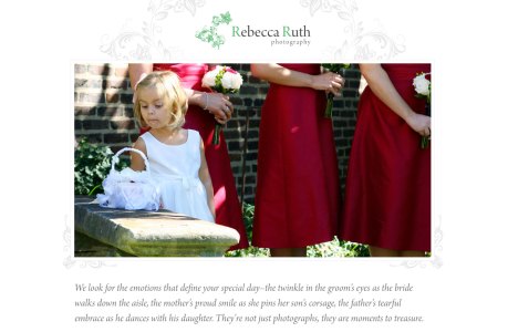
This photographers site has a simple slider which has a clear and easy to use set of thumb nails underneath the main picture. A simple click on any one will enlarge as the main slider picture. There is only one page to the sight which shows a large range of photograph styles and then underneath the three main price packages that are on offer. All very straightforward. Your decision and site experience is very simple and stylish. 

I really like this photographers site which is layed out like a pile of photographs. As you click on one it comes to the top of the pile, becomes sharp or colour if a colour shot, you can then move the picture into a different position to put other pictures into view as you would with a real pile of photographs. If you double click on the picture of your choice, it flips giving model details etc. on the back.  

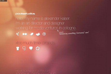
I really like the site below. The background colour and sunny feel are lovely and simple. All the icons move out as you hover over. The typeface is clean and elegant.

We are to research and report on the range of employment opportunities for web designers in the Brighton area. We are also to investigate and report on the role of the freelancer in web design.

The most important thing when freelancing wherever you happen to be based is to love what you are doing. Passion is particularly important when dealing with potential employers. Being able to demonstrate your love for the industry is much more important than your experience or technical ability. Ultimately this passion will be contagious and will rub off onto your clients, prospects and the work you do.

As a freelancer, you need a really good portfolio. Building up a portfolio can be quite tricky if you are starting out. The best way to do this is to contact friends and family and offer to build them a website. Doing this for FREE is not a good idea as this is potentially damaging to the industry and can also leave you in the difficult situation where your work isn’t valued. If you must do something for FREE, consider offering your services to a charity or community group who just wouldn’t be able to afford the services of a professional designer. Update your website whenever you finish a bit of work, it shows potential clients you’re active and gives your website more depth. If you’ve been working on the web for a while showcase your most recent work. People are very visual, so portfolios are a much easier prospect for designers. Be honest. If you didn’t do the design, or worked in partnership with someone else, let people know.

Networking is really important, especially when you are starting out,  “it’s not what you know, it’s who you know”. This is very true for a freelance web designer. The best way to get work is to use your contacts and network like mad. When starting out, let all of your friends and family know what you are doing. Ask if they know anybody who needs a website and whether they would mind introducing you. If you are going directly after end clients, local business networking events are a great source of contacts.

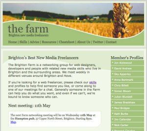
One such local network is called ‘Brighton Farm’ which is a networking group for web designers, developers and people with related new media skills who live in Brighton and the surrounding areas. They meet weekly in different venues around Brighton and Hove. If you become a member you can put a brief resume on their site with links to your portfolio site. They also have a page where the skills are listed of all the members.   
‘Wired Sussex’ is another group you can join in Brighton if you are looking for work or looking for someone to do work for you. 2171 companies and freelancers are Wired Sussex Members and they work together to support the development of a successful regional digital cluster. Based in Brighton, they deliver a wide range of services, initiatives and networks designed to assist their Members both individually and collectively. Whether you are looking to recruit (or find a new job!), get trained, find out about digital events and news in the region, or access new clients or investment, then they can help. There is also a place on the site that advertises desk space. So, if you are in games, web, mobile, software, animation, TV, music, film or online advertising in Sussex, they are worth contacting. 

Another similar site is ‘Freelance Advisor’, it is not local but covers UK and also PCG which is an independent not-for-profit professional association. Their mission is representing, supporting and promoting the freelance community, with specific attention to the needs of those freelancers who are members of PCG.     

Consider letting others do some work for you by contracting direct with a design agency. Agencies are always on the lookout for reliable freelancers, often at a moments notice. These agencies do the hard work of finding and managing clients, leaving you to get on and do what you’re best at. If you can hook up with half a dozen agencies in your local area, you should find enough work to keep you busy. One way to find potential agencies is to email everybody in your local area and let them know that you are available for freelance work. An even better way is to go where other web developers hang out.

Going to pub meetings, user groups and conferences is one of the best ways to make useful connections. People much prefer doing business with somebody they have met and feel comfortable with. Next time they need help on a particular project, they are much more likely to remember you and get in touch. If they know you are actively looking for projects, they are also more likely to recommend you to other people.

There are also a couple of really interesting places to rent desk space and get together with other freelancers called The Skiff in Brighton.

The Skiff is a coworking space in Brighton located at 6 Gloucester Street. It is generally open from 10am – 6pm weekdays.

The idea of The Skiff is to take the best elements of a coffee shop (social, energetic, creative) and the best elements of a workspace (productive, functional) and combine them to give independent workers the chance to have their own, affordable space.

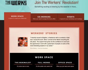
A similar place to this is The Werks. A great space to work but also links freelancers up with some of the most creative people in Brighton. The Werks ethos also promotes a sense of collaboration rather than competition. There is not only desk space to rent but rooms for meetings and workshops.



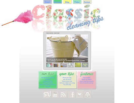
I decided to give Dreamweaver another go before I look at Rapidweaver, and started to put the home page together. I seem to be getting the basics ok now, getting more used to IDs, classes and checking any problems in the code.

I put in the logo, navigation and everything I had on my Photoshop page, but then just to complicate matters decided to put the Coda slider on as well. I changed the pictures to ones that I wanted, changed the colours and everything looked and worked fine. Then I tried to put it into my page. How frustrating…didn’t want to work, but after a lot of swearing and persistence got there in the end. I also added a subtle background behind the main content with a gradient to hold the elements on the page together.

I copied this for the next ‘our tips’ page and removed the elements I didn’t want repeated. Because there was a lot of information that needed to be included here and I didn’t want it to have a lot of dense text to wade through I decided to put in an accordion which I added using DW. To give it more of a Web 2.0 feel I decided to add rounded corners. I went to the CSS3 PIE site which is really easy to use as you can change and see what you want before you download it. I chose colours from my Web 2.0 Kuler palette for the accordion and headings which I kept quite large and bold also to fit in with the web 2.0 style.

I thought I would use another slider on this page to show the main ingredients used in old fashioned cleaning in a bold graphic way. (Also I wanted another go at putting a slider into a web page to see if it was any simpler following the instructions in a careful methodical way!). I changed all the colours and pictures to get it looking exactly how I wanted it and put it into the page, copying the javascript into the JS folder, the CSS file, the images into the images file and the code into the HTML. It didn’t work! After a lot of careful scrutinising of the code I found that the source code for part of it was in an extra folder, after changing this it worked.

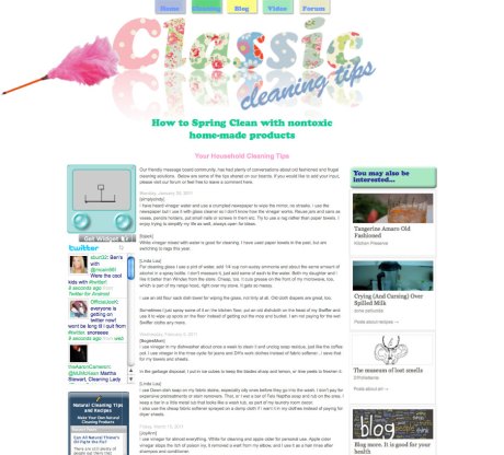
I copied the page for ‘your tips’ which was next. I wanted this to be a blog where current items could be talked about to keep the site up to date with any green issues, new non-toxic products, current trends, or any tips sent in could be added. I also wanted it to have links to related blogs. It is not easily possible to add a blog using DW so I set it up to look like one.

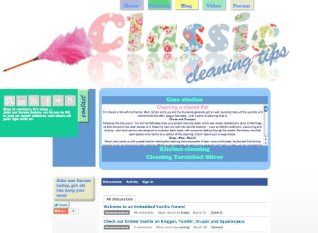
On this page I also added three widgets. I went to widget box, chose the ones I thought would fit in with my site, cutomised them and downloaded them. I chose a Tweet blender which you could change the colours, font size, language and the subject of the tweets. So I have cleaning related tweets being updated every 10 seconds. I also chose a Natural cleaning tips and recipe widget and thirdly an etch a sketch for light relief after cleaning!

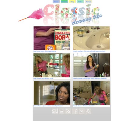
The next page I tackled was the video page. I didn’t want the page to look cluttered so only wanted to show video on it. After choosing the ones I wanted it was very easy to copy the code to link them to the site.

My fifth page was my forum page. I chose a vanilla forum which was relatively easy to put into the page. You can sign in and leave a comment.

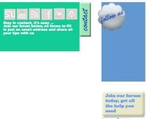
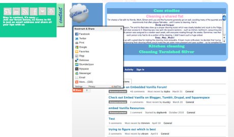
Above this I added another accordion which included more specific cleaning information. I kept the colours the same as the ‘cleaning’ page for consistency. I added a shiny button to get visitors to join the forum and a shiny button at the side which when clicked opened out to include the social network buttons. I also added a tweet button and a share button.

I linked all the page navigation together, and all the information on the home page tiles to the appropriate pages. I then linked all the social network buttons to their specific sites.

I used Genfavicon this time and made a favicon using the image of the pink duster that appears on each page.

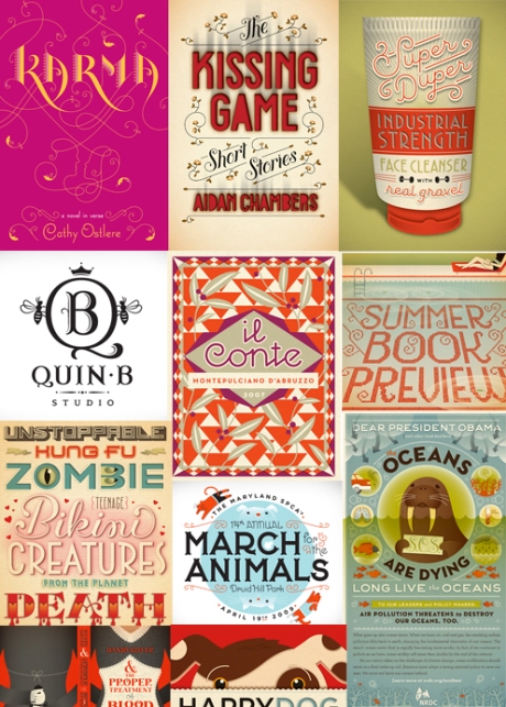
After looking at a lot of Web 2.0 retro style sites I started to think about how my own site should look. To begin with I looked at fonts that would fit with the theme. While I was researching type I came across a designer Illustrator who had some really beautiful and inspiring work, Jessica Hirche.

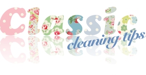
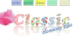
I decided to try a chunky face with vintage style fabric patterns styling each letter. I found different fabrics and brought them all into Illustrator with the text I thought would work the best. I selected the text and a different fabric for each letter, went to Object > Clipping Mask > Make and I had a version which had a different pattern on each letter that I could take into Photoshop. I thought I would use the shiny effect I had experimented with in class using a repeated layer and the gradient tool.

I changed a couple of the fabric samples which looked more balanced colour wise.I tried to find social network icons that would fit with the style of my page and downloaded some which looked as if they were stitched. They are simple enough for the Web 2.0 style and relate to the fabric patterns used in the logo. I put them on to a different fabric pattern along the bottom of the page.

Before anything else I chose a colour theme for the site. I looked up some Web 2.0 themes and picked a theme that would go with the logo I had already done. Maybe I should have done that the other way round!

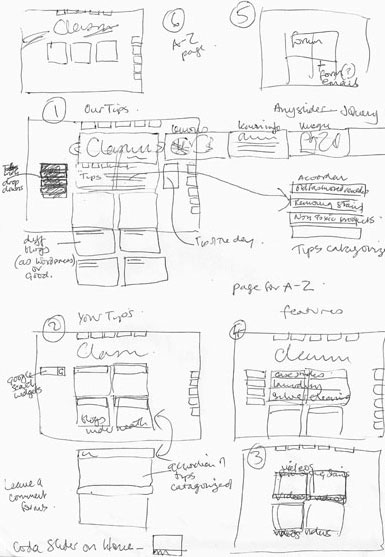
I started to think about the structure of the site. Once I had got an idea of how I wanted the site to look and how I was going to incorporate everything we had learnt about, I put together the layouts for the first couple of pages in Photoshop.I looked at a few different styles for the navigation. Different coloured type for each section, which I did like and different buttons, some as side navigation and some top. For the buttons I drew rectangles in Photoshop and put a smooth bevel on them, with a drop shadow. The idea was to make them look like tiles which fit in with the ‘Cleaning’ theme of the site, (tiles make you think of kitchens and bathrooms, two places which take a lot of cleaning!)

I looked at other social network icons, but decided to keep with the ones I had already found. I made some square tiles in Photoshop, using the workshop we did in class, blending a gradient for a shiny effect. I had two images on separate layers. One was the tile that I had made using the emboss and drop shadow effects. The other was an ellipse which I positioned over the tile shape. I clicked on the layer to be blended, clicked on the ‘add vector mask’ button on the bottom of the palette, then clicked on the gradient tool and drew a line across the elipse to fade one side out. I then clicked in between both layers in the layer panel, and clicked ‘alt’. This then combined the shape with the tile image to make it look shiny.

The second page I looked at when I was happy with the home page was the one which would include the cleaning tips. I put four tiles of the same colour together to make a background for the  text. I also tried the icons for Facebook etc down the side.

For the workshop on sliders I chose the ‘anything’ slider to try out. I used the example set up and changed all the pictures and colours. I opened up each picture in Photoshop, chose some different ones and placed them over the top of the original ones so that they would be the correct size for the slider, and then re saved them but keeping the same name. I then went into the slider css file and changed the colours of the tabs and borders. The other information you need to copy over into your file is the javascript into the JS folder and the css style sheet for the slider. The script code for the slider should be put in the head section of your site.